Interacting with Devices
Introduction
Interacting with devices is a pivotal part of any smart environment simulation. In our system, each device not only has a visual representation in the scene (Fig. 1), but also a virtual control panel (Fig. 2) through which participants can interact with the device's internal logic, such as powering it on/off or adjusting a temperature setting. These control panels are dynamically rendered based on an abstract interaction model. Creating a unique control panel for every possible smart device is impractical. To support generalizability across many device types( From sensors to smart home appliance), we adopt a structured interaction model inspired by the W3C Thing Description (TD), extended via TDeX. While TD includes metadata for networking and affordances, TDeX focuses on interaction types and their corresponding GUI elements.
Accoridng to TDeX, smart devices may vary greatly in appearance, complexity, and capabilities, yet the types of interactions users perform fall into a small number of reusable categories. For example:
-
Turning a heater on or off is conceptually similar to locking or unlocking a door. Both involve a two-state toggle that alternates between binary values (e.g., on/off, locked/unlocked). These interactions are typically visualized using a switch or toggle button in the control panel.
-
Setting the temperature of a deep fryer or adjusting the brightness of a smart light involves choosing a value from a continuous or discrete numerical range. Such interactions are best represented via a slider, allowing users to quickly navigate the spectrum of available values.
-
Some actions are independent of internal device state and can be performed repeatedly without regard to current conditions. Examples include taking a snapshot with a security camera or dispensing food from a pet feeder. These actions are most intuitively presented via a button, which simply triggers the action on press.
TDeX captures this insight by categorizing all interactions into a small, expressive set of interaction types, each linked to a specific GUI element for rendering in the control panel.
| Type | Description | Example | GUI Element |
|---|---|---|---|
| Dynamic Property | Continuously updated internal state | Temperature of fryer | Text/Label bound to state |
| Static Property | Fixed attribute of a device | Model number | Text (non-interactive) |
| Stateless Action | No internal state dependency | Take snapshot | Button |
| Boolean Action | Two-valued toggleable state | Power on/off | Toggle switch |
| Numerical Action | Range-based parameter setting | Temperature, brightness | Slider or input box |
| Generic Action | Enum-based selection from fixed values | Washing machine modes | Dropdown |
| Composed Action | Composite of multiple atomic actions | Order coffee (milk + sugar + type) | Grouped UI with trigger |
Interaction Schema
An Interaction is described by a set of key properties:
-
InteractionType: Specifies the type of the action (e.g., Stateless_Action, Boolean_Action, etc.), which directly determines its behavior and corresponding visualization of the control panel. -
name: A string that labels the action in the GUI (e.g., "Take Snapshot","Power"). -
inputData: Defines the required input structure — such as value type, range, unit, or discrete values. -
currentState: Describes the current internal value of the action (if applicable), as well as its visibility in the GUI. -
visible: It supports flexible control over when the interaction should be shown and whether it is interactive. This is useful for dependent settings, like a "Mute" toggle that only appears after the TV is powered on (see Visibility Condition) -
output(optional): in most cases, the output of an action in a smart device results in a physical effect on the device or its environment, such as turning a light on or off, making a coffee, or opening a door. However, in some instances, actions may also produce structured output, such as a duration or a calculated value. For example, when the "Start" action is triggered on a washing machine, in addition to changing the system’s state, it may also calculate and visually display the estimated time needed to complete the washing cycle, based on the selected program and the weight of the clothes. These outputs are encoded as part of the action’s schema.
Dynamic Property
A Dynamic Property represents a value that is continuously updated by the system or device. It is read-only from the participant’s perspective and is used to display internal states of devices, such as temperature or energy consumption. Usually, after some actions are performed, the internal state of a device changes, either immediately (e.g., when turning on a light, the power status changes instantly), or gradually (e.g., when setting a fryer to 100 °C, the temperature increases over time). In such cases, the Dynamic Property reflects the current internal value at any given time, offering participants real-time feedback on the system’s status.
Dynamic properties are rendered in the GUI as live, read-only labels or indicators, and update in real-time as the device state changes.
Common Use Cases:
- Monitoring sensor-based or calculated values (e.g., Coffee level or water tank status)
- Used to display internal state values that are:
- Continuously changing
- Bound to physical processes
- Dependent on other interactions (e.g., changes after executing an action)
JSON Schema
JSON Schema Code
Dynamic Property Schema
{
  "type": "object",
  "properties": {
    "InteractionType": {
      "type": "string",
      "enum": [
        "Dynamic_Property"
      ]
    },
    "name": {
      "type": "string"
    },
    "outputData": {
      "type": "object",
      "properties": {
        "valueType": {
          "type": "array",
          "items": {
            "type": "string"
          },
          "minItems": 2,
          "maxItems": 2,
          "contains": {
            "enum": [
              "PrimitiveType",
              "String"
            ]
          }
        },
        "unitOfMeasure": {
          "type": [
            "string",
            "null"
          ]
        }
      },
      "required": [
        "valueType",
        "unitOfMeasure"
      ],
      "additionalProperties": false
    },
    "currentState": {
      "type": "object",
      "properties": {
        "visible": {
          "oneOf": [
            {
              "type": "boolean",
              "description": "For Dynamic_Property: true = shown as read-only, false = not shown at all"
            },
            {
              "type": "array",
              "items": {
                "type": "object",
                "properties": {
                  "name": {
                    "type": "string"
                  },
                  "value": {
                    "type": [
                      "string",
                      "number",
                      "boolean"
                    ]
                  }
                },
                "required": [
                  "name",
                  "value"
                ],
                "additionalProperties": false
              },
              "description": "For Dynamic_Property: conditions determine if shown as read-only or not shown at all"
            }
          ]
        },
        "value": {
          "type": "string"
        }
      },
      "required": [
        "visible",
        "value"
      ],
      "additionalProperties": false
    }
  },
  "required": [
    "InteractionType",
    "name",
    "outputData",
    "currentState"
  ],
  "additionalProperties": false
}
The specification of Interaction's fields (introduced above) for a Dynamic Property are as follows:
-
InteractionType: Must be set to "Dynamic_Property" to declare this as a read-only, real-time property. -
outputData:valueType: This must be set a primitive type, depending on the nature of the data, such as ["PrimitiveType", "String"], ["PrimitiveType", "Integer"]unitOfMeasure:String label for the unit (e.g., "°C", "L", "minutes"). Can be null if no unit is shown.
-
currentStatevalue: The current or initial state.visible: Visibility flag or condition (see Visibility Condition)
Dynamic Property Example 1: Current Temperature Display
  "InteractionType": "Dynamic_Property",
  "name": "Current Temperature",
  "outputData": {
    "valueType": ["PrimitiveType", "Integer"],
    "unitOfMeasure": "°C"
  },
  "currentState": {
    "visible": true,
    "value": "175"
  }
}
The above snippet defines a read-only temperature display labeled "Current Temperature", showing the current internal value of the device (175°C). The value is continuously updated by the system and is always visible in the GUI.
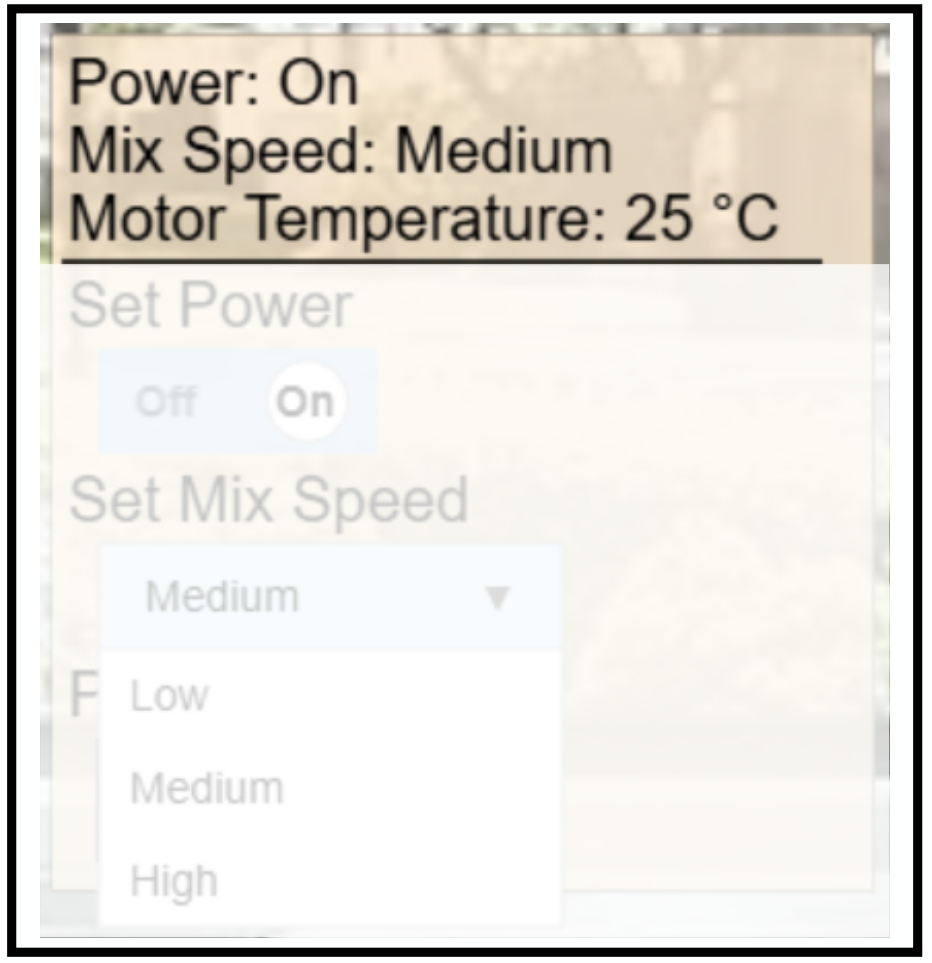
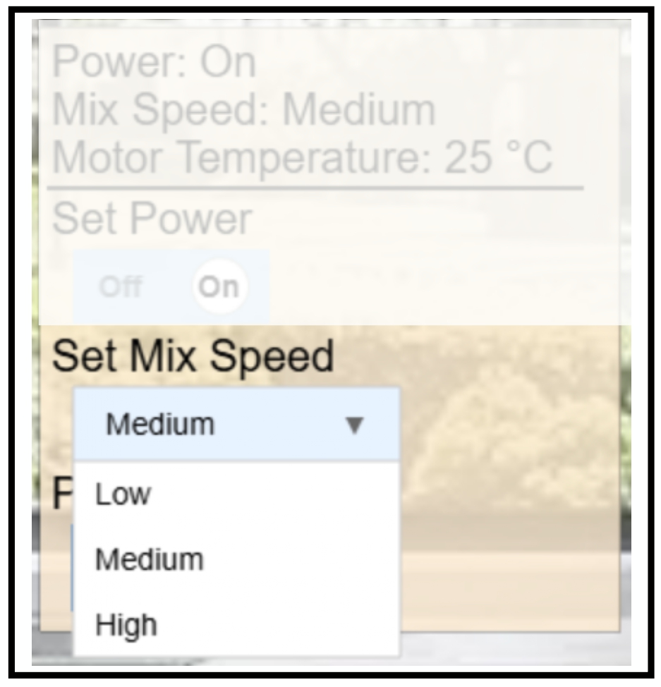
GUI Example of a Dynamic Property This image shows the visual representation of a device’s dynamic properties, including power state, mix speed, and temperature. These values are read-only and continuously updated in the GUI.
Dynamic Property Example 2: Water Level Display with Conditional Visibility
{
  "InteractionType": "Dynamic_Property",
  "name": "Water Level",
  "outputData": {
    "valueType": ["PrimitiveType", "String"],
    "unitOfMeasure": "L"
  },
  "currentState": {
    "visible": [
      { "name": "Power", "value": true }
    ],
    "value": "0.8"
  }
}
The above snippet defines a water level indicator that displays the current value "0.8" (liters).
This display is conditionally visible, it only appears when the device’s Power is turned on.
Stateless Action
A Stateless Action models an interaction that does not store or depend on internal state. It can be triggered any number of times and is designed for event-like, one-shot operations. This is the simplest type of interaction in TDeX and is typically used for actions that are repeatable, non-parameterized, and do not alter persistent device status.
Common Use Cases:
- Actions that are purely event-driven, without requiring or updating internal state
- Actions that can be executed repeatedly without restriction
- Actions that result in external effects, such as mechanical or sensory responses (e.g., flashes, sounds, movement), but do not toggle or store values
JSON Schema
JSON Schema Code
Stateless Action Schema
{
  "type": "object",
  "properties": {
    "InteractionType": {
      "type": "string",
      "enum": [
        "Stateless_Action"
      ]
    },
    "name": {
      "type": "string"
    },
    "inputData": {
      "type": "object",
      "properties": {
        "valueType": {
          "type": "array",
          "items": {
            "type": "string"
          },
          "minItems": 2,
          "maxItems": 2,
          "contains": {
            "enum": [
              "null"
            ]
          }
        },
        "unitOfMeasure": {
          "type": "string",
          "enum": [
            "null"
          ]
        }
      },
      "required": [
        "valueType",
        "unitOfMeasure"
      ],
      "additionalProperties": false
    },
    "currentState": {
      "type": "object",
      "properties": {
        "visible": {
          "oneOf": [
            {
              "type": "boolean",
              "description": "For Stateless_Action: true = button shown and clickable, false = button hidden/disabled"
            },
            {
              "type": "array",
              "items": {
                "type": "object",
                "properties": {
                  "name": {
                    "type": "string"
                  },
                  "value": {
                    "type": [
                      "string",
                      "number",
                      "boolean"
                    ]
                  }
                },
                "required": [
                  "name",
                  "value"
                ],
                "additionalProperties": false
              },
              "description": "For Stateless_Action: conditions determine if button is shown and clickable or hidden/disabled"
            }
          ]
        }
      },
      "required": [
        "visible"
      ],
      "additionalProperties": false
    }
  },
  "required": [
    "InteractionType",
    "name",
    "inputData",
    "currentState"
  ],
  "additionalProperties": false
}
Stateless Action Example 1: Take Snapshot Button
{
  "InteractionType": "Stateless_Action",
  "name": "Take Snapshot",
  "inputData": {
    "valueType": ["PrimitiveType", "null"],
    "unitOfMeasure": "null"
  },
  "currentState": {
    "visible": true
  }
}
The above snippet defines a stateless button labeled "Take Snapshot" that is always visible. When clicked, it initiates an immediate snapshot from the smart camera.
Stateless Action Example 2: Conditional Pet Feeder Release
{
  "InteractionType": "Stateless_Action",
  "name": "Feed Pet",
  "inputData": {
    "valueType": ["PrimitiveType", "null"],
    "unitOfMeasure": "null"
  },
  "currentState": {
    "visible": [
      { "name": "Power", "value": true }
    ]
  }
}
This button dispenses food only if the Power is turned on, making the interaction context-sensitive and realistic.
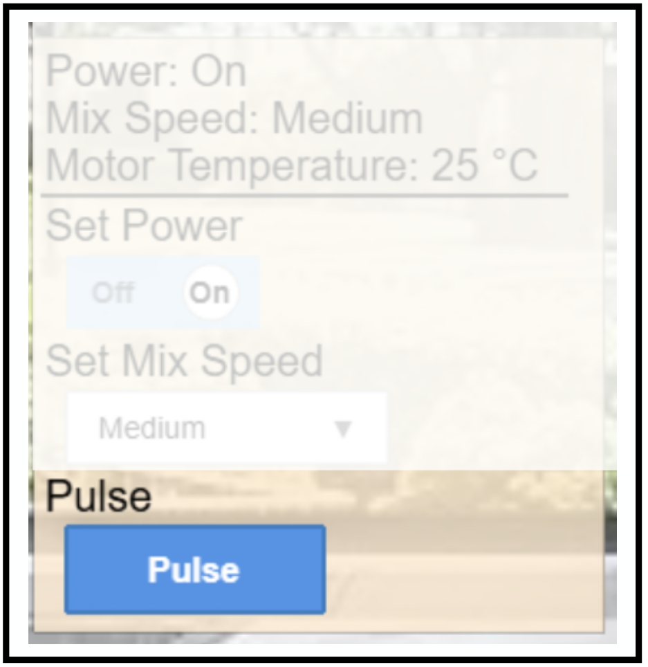
GUI Example of a Stateless Action
Boolean Action
A Boolean Action models an interaction with exactly two possible states, such as on/off, enabled/disabled, or open/close.
This type of interaction is ideal for simple toggles and switch-like controls, and is one of the most common primitives in smart home interfaces.
Common Use Cases:
- Power toggle (e.g., turning a coffee machine on/off)
- Binary operating modes (e.g., High vs. Low)
- Physical state detection (e.g., book open/closed)
JSON Schema
JSON Schema Code
Boolean Action Schema
{
  "type": "object",
  "properties": {
    "InteractionType": {
      "type": "string",
      "enum": [
        "Boolean_Action"
      ]
    },
    "name": {
      "type": "string"
    },
    "inputData": {
      "type": "object",
      "properties": {
        "valueType": {
          "type": "array",
          "items": {
            "type": "string"
          },
          "minItems": 2,
          "maxItems": 2,
          "contains": {
            "enum": [
              "PrimitiveType",
              "Boolean"
            ]
          }
        },
        "unitOfMeasure": {
          "type": [
            "string",
            "null"
          ]
        },
        "type": {
          "type": "object",
          "properties": {
            "True": {
              "type": "string"
            },
            "False": {
              "type": "string"
            }
          },
          "required": [
            "True",
            "False"
          ],
          "additionalProperties": false
        }
      },
      "required": [
        "valueType",
        "unitOfMeasure",
        "type"
      ],
      "additionalProperties": false
    },
    "currentState": {
      "type": "object",
      "properties": {
        "visible": {
          "oneOf": [
            {
              "type": "boolean",
              "description": "For Boolean_Action: true = status shown + interactive control available, false = interactive control grayed out/disabled (status always shown)"
            },
            {
              "type": "array",
              "items": {
                "type": "object",
                "properties": {
                  "name": {
                    "type": "string"
                  },
                  "value": {
                    "type": [
                      "string",
                      "number",
                      "boolean"
                    ]
                  }
                },
                "required": [
                  "name",
                  "value"
                ],
                "additionalProperties": false
              },
              "description": "For Boolean_Action: conditions determine if interactive control is available or grayed out/disabled (status always shown)"
            }
          ]
        },
        "value": {
          "type": "boolean"
        }
      },
      "required": [
        "visible",
        "value"
      ],
      "additionalProperties": false
    }
  },
  "required": [
    "InteractionType",
    "name",
    "inputData",
    "currentState"
  ],
  "additionalProperties": false
}
The specification of Interaction's fields for a Boolean Action are as follows:
-
InteractionType: This must be set to "Boolean_Action" to identify the interaction as a two-state toggle. -
inputData:valueType: This must be set to ["PrimitiveType", "Boolean"]unitOfMeasure: Set to "null" (no unit applies for Boolean Action)type: A mapping between Boolean values (true/false) and display strings (e.g., "On", "Off")
-
currentStatevalue: The current or initial state ("true" or "false")visible: Visibility flag or condition (see Visibility Condition)
Boolean Action – Example 1: Power Toggle
{
    "InteractionType": "Boolean_Action",
    "name": "Power",
    "inputData": {
        "valueType": ["PrimitiveType", "Boolean"],
        "unitOfMeasure": null,
        "type": {
            "True": "On",
            "False": "Off"
        }
    },
    "currentState": {
        "visible": true,
        "value": true
    }
}
The above snippet defines a Power control (e.g., for a smart appliance) with the following characteristics:
- A toggle rendered with "On" and "Off" labels
- Initial state set to "ON" as the
valueinCurrentStateis set to true. - Always visible and interactive
GUI Example of a Boolean Action
Boolean Action – Example 2: Mode Switch
{
    "InteractionType": "Boolean_Action",
    "name": "Mode",
    "inputData": {
        "valueType": ["PrimitiveType", "Boolean"],
        "unitOfMeasure": null,
        "type": {
            "True": "High",
            "False": "Low"
        }
    },
    "currentState": {
        "visible": [
            { "name": "Power", "value": true }
        ],
        "value": false
    }
}
The above snippet defines a Mode toggle with two possible states of "High" and "Low", which could, for example, represent an interaction type for a fan.
The value in currentState is set to "true", indicating that on initial rendering, the toggle is set to "Low".
Furthermore, the toggle is visible only when the device’s Power is "On" supporting context-sensitive visualization and reflecting realistic constraints found in physical appliances (see Visibility Condition).
Numerical Action
A Numerical Action models an interaction that involves selecting a value from a predefined numerical range, such as setting temperature, adjusting brightness, or choosing volume levels. It supports discrete intervals and is rendered using a slider or numeric input field in the user interface.
Common Use Cases:
- Used for continuous control interactions involving quantities such as temperature, brightness, speed, or volume
- Designed for bounded input ranges, where users can only select from a specified minimum and maximum
- Can be configured to be interactive or read-only, depending on the current system state
- Typically modeled using sliders or step-wise selectors, defined by a range and interval
JSON Schema
JSON Schema Code
Numerical Action Schema
{
  "type": "object",
  "properties": {
    "InteractionType": {
      "type": "string",
      "enum": [
        "Numerical_Action"
      ]
    },
    "name": {
      "type": "string"
    },
    "inputData": {
      "type": "object",
      "properties": {
        "valueType": {
          "type": "array",
          "items": {
            "type": "string"
          },
          "minItems": 2,
          "maxItems": 2,
          "contains": {
            "enum": [
              "PrimitiveType",
              "Integer"
            ]
          }
        },
        "unitOfMeasure": {
          "type": "string"
        },
        "type": {
          "type": "object",
          "properties": {
            "Range": {
              "type": "array",
              "items": {
                "type": "number"
              },
              "minItems": 2,
              "maxItems": 2
            },
            "Interval": {
              "type": "array",
              "items": {
                "type": "number"
              },
              "minItems": 1,
              "maxItems": 1
            }
          },
          "required": [
            "Range",
            "Interval"
          ],
          "additionalProperties": false
        }
      },
      "required": [
        "valueType",
        "unitOfMeasure",
        "type"
      ],
      "additionalProperties": false
    },
    "currentState": {
      "type": "object",
      "properties": {
        "visible": {
          "oneOf": [
            {
              "type": "boolean",
              "description": "For Numerical_Action: true = status shown + interactive control available, false = interactive control grayed out/disabled (status always shown)"
            },
            {
              "type": "array",
              "items": {
                "type": "object",
                "properties": {
                  "name": {
                    "type": "string"
                  },
                  "value": {
                    "type": [
                      "string",
                      "number",
                      "boolean"
                    ]
                  }
                },
                "required": [
                  "name",
                  "value"
                ],
                "additionalProperties": false
              },
              "description": "For Numerical_Action: conditions determine if interactive control is available or grayed out/disabled (status always shown)"
            }
          ]
        },
        "value": {
          "type": "number"
        }
      },
      "required": [
        "visible",
        "value"
      ],
      "additionalProperties": false
    }
  },
  "required": [
    "InteractionType",
    "name",
    "inputData",
    "currentState"
  ],
  "additionalProperties": false
}
The specification of Interaction's fields for a Numerical Action are as follows:
-
InteractionType: Must be set to "Numerical_Action" to declare the action as numerical. -
inputData:valueType: Always ["PrimitiveType", "Integer"] for numerical actionsunitOfMeasure: String label for unit (e.g., "°C", "dB", "%")type:Range: [min, max] values defining the valid rangeInterval: Step size for permitted inputs
-
currentState:value: The current or initial numerical value shown in the interfacevisible: Visibility flag or condition (see Visibility Condition)
Numerical Action – Example 1: Temperature Control
The snippet below defines a Temperature control that allows users to select a value between "0°C" and "250°C" in discrete steps of "25°C" — for instance, to set the temperature of a deep fryer.
{
    "InteractionType": "Numerical_Action",
    "name": "Temperature",
    "inputData": {
        "valueType": ["PrimitiveType", "Integer"],
        "unitOfMeasure": "°C",
        "type": {
            "Range": [0, 250],
            "Interval": [25]
        }
    },
    "currentState": {
        "visible": [
            { "name": "Power", "value": true }
        ],
        "value": 0
    }
}
- The initial value is set to "0°C", as defined in the
valuefield ofcurrentState. - The control is only visible when the associated
Powertoggle is set totrue. - The
unitOfMeasureis shown alongside the value in the GUI, ensuring clarity for participants. - The step size defined in
Intervalenforces a fixed increment of "25°C", allowing only 11 valid input values (0, 25, …, 250).
This configuration enables bounded, interval-based numerical input and supports conditional visibility based on other device states (see Visibility Condition).
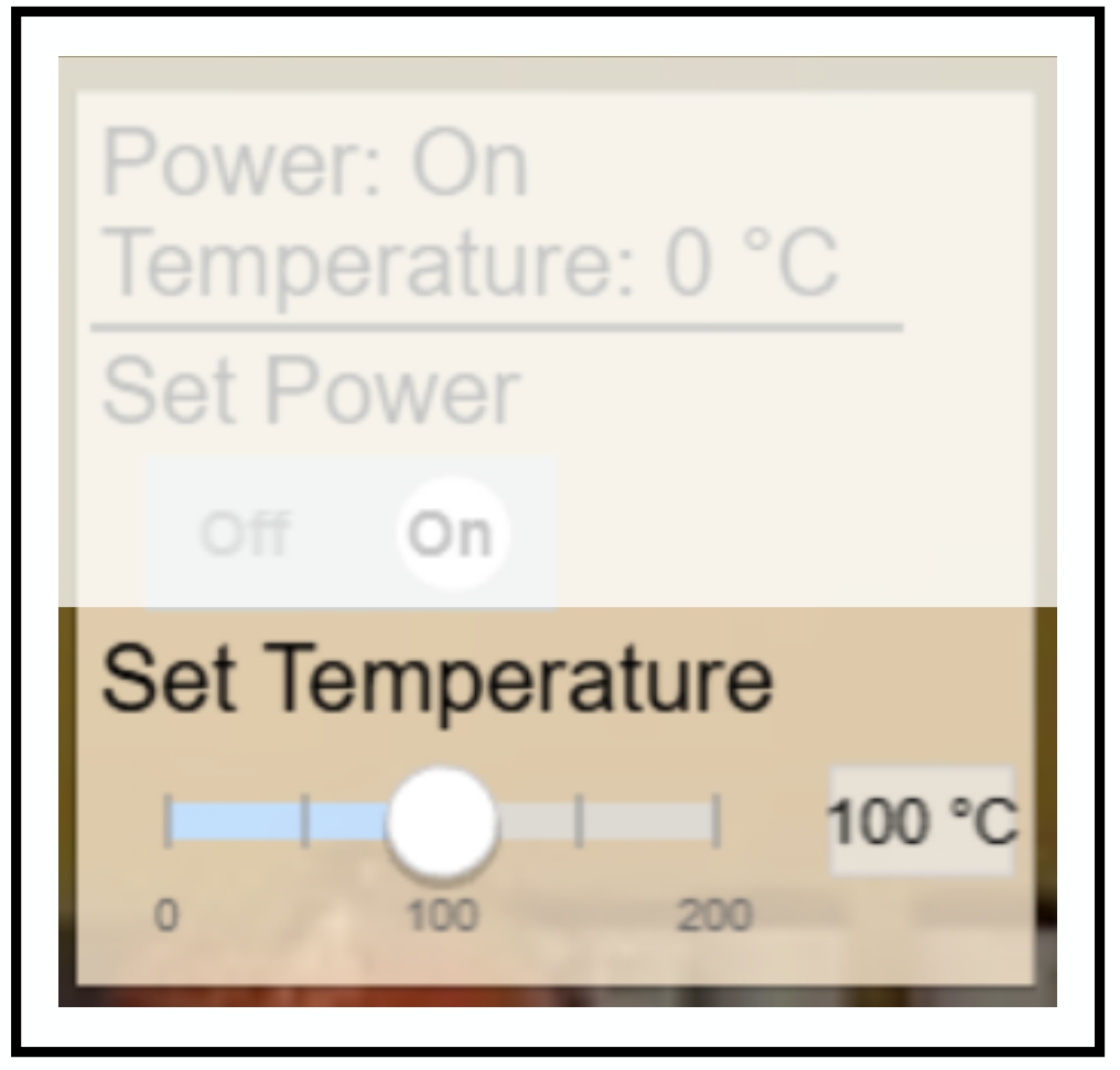
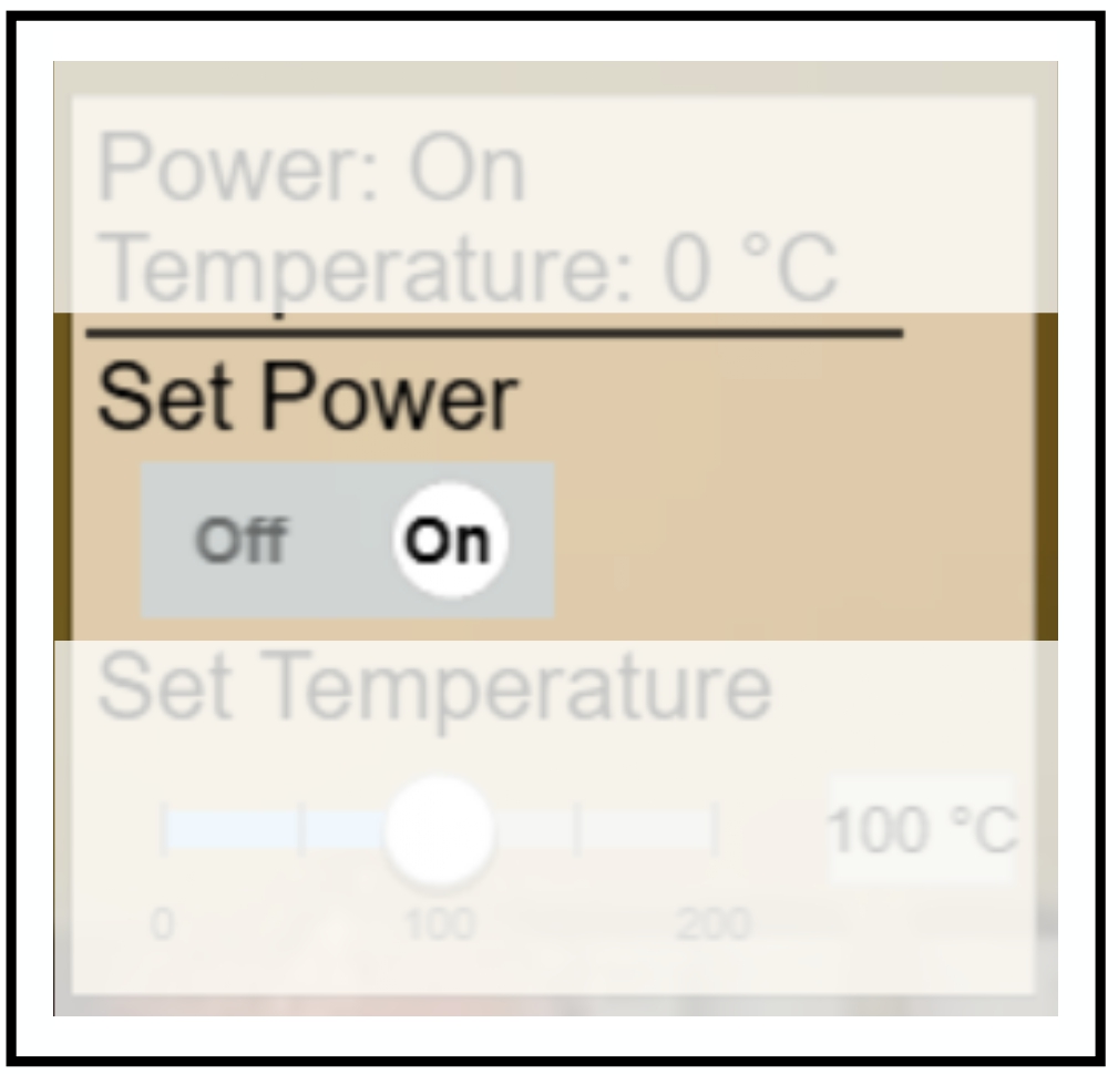
GUI Example of a Numerical Action The Set Temperature action immediately updates the target value (100 °C), but the actual temperature property remains at 0 °C initially. It will gradually increase over time, reflecting the physical behavior of the system.
Numerical Action – Example 2: Volume Control
{
    "InteractionType": "Numerical_Action",
    "name": "Volume",
    "inputData": {
        "valueType": ["PrimitiveType", "Integer"],
        "unitOfMeasure": "dB",
        "type": {
            "Range": [0, 100],
            "Interval": [10]
        }
    },
    "currentState": {
        "visible": [
            { "name": "Power", "value": true }
        ],
        "value": 50
    }
}
The above snippet defines a Volume control that enables users to select sound levels in the range of "0 dB" to "100 dB", with discrete steps of "10 dB".
- The initial value is set to "50 dB", as specified in the
valuefield ofcurrentState. - The control is only visible when the associated
Powercontrol is set to "true". - The
unitOfMeasureis "dB", and will be displayed alongside the numeric value in the GUI. - The defined
Intervalof "10 dB" enforces stepwise adjustments, allowing 11 valid input values (0, 10, 20, …, 100).
This setup provides a structured and intuitive interface for quantitative control of volume, while maintaining conditional visibility in context-sensitive scenarios((see Visibility Condition)).
Generic Action
A Generic Action models an interaction where the user must choose from a fixed set of discrete string-labeled options. It is ideal for settings where actions are not numeric or boolean, but instead belong to an enumerated set of modes or presets.
These actions are rendered in the GUI as Dropdown Menus, Radio Button groups, or other selection widgets that support labeled options.
Common Use Cases
- Selecting from predefined modes (e.g., washing machine programs)
- Choosing input sources (e.g., "HDMI 1", "HDMI 2", "USB")
- Setting device profiles (e.g., "Eco", "Turbo", "Night Mode")
- Selecting functional categories (e.g.,
Defrost modefor "Vegetables", "Meat", or "Bread")
JSON Schema
JSON Schema Code
Generic Action Schema
{
  "type": "object",
  "properties": {
    "InteractionType": {
      "type": "string",
      "enum": [
        "Generic_Action"
      ]
    },
    "name": {
      "type": "string"
    },
    "inputData": {
      "type": "object",
      "properties": {
        "valueType": {
          "type": "array",
          "items": {
            "type": "string"
          },
          "minItems": 2,
          "maxItems": 2,
          "contains": {
            "enum": [
              "PrimitiveType",
              "String"
            ]
          }
        },
        "unitOfMeasure": {
          "type": [
            "string",
            "null"
          ]
        },
        "type": {
          "type": "object",
          "properties": {
            "String": {
              "type": "object",
              "properties": {
                "Options": {
                  "type": "array",
                  "items": {
                    "type": "string"
                  },
                  "minItems": 1,
                  "uniqueItems": true
                }
              },
              "required": [
                "Options"
              ],
              "additionalProperties": false
            }
          },
          "required": [
            "String"
          ],
          "additionalProperties": false
        }
      },
      "required": [
        "valueType",
        "unitOfMeasure",
        "type"
      ],
      "additionalProperties": false
    },
    "currentState": {
      "type": "object",
      "properties": {
        "visible": {
          "oneOf": [
            {
              "type": "boolean",
              "description": "For Generic_Action: true = status shown + interactive control available, false = interactive control grayed out/disabled (status always shown)"
            },
            {
              "type": "array",
              "items": {
                "type": "object",
                "properties": {
                  "name": {
                    "type": "string"
                  },
                  "value": {
                    "type": [
                      "string",
                      "number",
                      "boolean"
                    ]
                  }
                },
                "required": [
                  "name",
                  "value"
                ],
                "additionalProperties": false
              },
              "description": "For Generic_Action: conditions determine if interactive control is available or grayed out/disabled (status always shown)"
            }
          ]
        },
        "value": {
          "type": "string"
        }
      },
      "required": [
        "visible",
        "value"
      ],
      "additionalProperties": false
    }
  },
  "required": [
    "InteractionType",
    "name",
    "inputData",
    "currentState"
  ],
  "additionalProperties": false
}
The specification of Interaction's fields for a Generic Action are as follows:
-
InteractionType: Must be set to "Generic_Action" to declare the action as numerical. -
inputData:valueType: Always ["PrimitiveType", "String"] for Generic ActionsunitOfMeasure: Optional string label (can be null); not typically usedtype: An array of unique string values that represent the available options
-
currentStatevalue: The current or initial option selected (must match one of the values in Options)visible: Controls whether the dropdown is visible and interactive (see Visibility Condition)
Generic Action Example 1: Washing Machine Mode Selector
{
  "InteractionType": "Generic_Action",
  "name": "Program",
  "inputData": {
    "valueType": ["PrimitiveType", "String"],
    "unitOfMeasure": null,
    "type": {
      "String": {
        "Options": ["Quick Wash", "Delicate", "Heavy", "Eco"]
      }
    }
  },
  "currentState": {
    "visible": true,
    "value": "Eco"
  }
}
The above snippet defines a mode selector with four labeled options, and the default selected value is "Eco".
Generic Action Example 2: Input Source Selector
{
  "InteractionType": "Generic_Action",
  "name": "Input Source",
  "inputData": {
    "valueType": ["PrimitiveType", "String"],
    "unitOfMeasure": null,
    "type": {
      "String": {
        "Options": ["HDMI 1", "HDMI 2", "USB", "AV"]
      }
    }
  },
  "currentState": {
    "visible": [
      { "name": "Power", "value": true }
    ],
    "value": "HDMI 1"
  }
}
In the example above, the user can choose the input source, but only if the device’s Power is turned on.
GUI Example of a Generic Action
Visibility Conditions
The visible field in currentState plays a central role in determining when and how an interaction is shown to the user.
It allows both simple control over visibility and sophisticated conditional logic, enabling context-sensitive and phase-dependent
interaction designs.
Visibility Modes
| Mode | Syntax | Effect |
|---|---|---|
| Always Interactive | "visible": true | The interaction is always visible and user-editable |
| Read-Only Display | "visible": false | The interaction is always shown but cannot be modified |
| Contextual Conditions | visible: [ ... ] | The interaction is only editable if all listed conditions are met (AND logic) |
Conditional Visibility
Single Condition
"visible": [
  { "name": "Power", "value": true }
]
The interaction becomes interactive only when Power is "true".
Multiple Conditions (AND Logic)
"visible": [
  { "name": "Power", "value": true },
  { "name": "Mode", "value": "Advanced" }
]
The interaction is interactive only when both Power is "true" and Mode is "Advanced".
Common Use Cases:
-
Read-Only Status: Show current values from sensors or devices (e.g., temperature, fill level) that cannot be altered by users.
-
Safety Controls: Prevent access to potentially dangerous controls unless certain prerequisites are met (e.g., child lock active).
-
Progressive Disclosure: Hide advanced options until a basic setup is complete or a prior interaction is enabled.
-
Context-Sensitive Interfaces: Display or activate UI elements based on the current state of the device or other controls (e.g., brightness only when a light is on).
-
Phase-Controlled Studies: Control what participants can see or modify during different experimental stages in your user study.
Examples Using Conditional Visibility
- Dynamic Property Example 2: Water Level Display with Conditional Visibility
- Stateless Action Example 2: Conditional Pet Feeder Release
- Boolean Action – Example 2: Mode Switch
- Numerical Action – Example 2: Volume Control
- Generic Action Example 2: Input Source Selector
Integration with Visual States
When participants interact with a device, by pressing a button, toggling a switch, or adjusting a slider, the internal state of that device changes. But to make this change visible and intuitive, the device’s appearance should update as well. This is where Visual States come into play.
Visual states define how a device looks at any given moment, based on its current state. These are essentially the images or GUI elements that participants see in the interface. For example:
- When a light is turned on, it should appear visually brighter.
- When a TV is powered off, it might display a blank screen image.
- When brewing coffee, the visible water level might gradually drop.
These graphical changes enhance immersion and clarity for the participant. For full details and structure, see Visual States
You can configure visual states by uploading appropriate image assets and linking them to device conditions. When these conditions are met, the corresponding image is shown.
Example Integration:
// Boolean interaction
{
    "InteractionType": "Boolean_Action",
    "name": "Power",
    "currentState": {
        "value": false
    }
}

// Corresponding visual states
{
    "visualState": [
        {
            "default": true,
            "image": "device_off.png"
        },
        {
            "conditions": [
                { "name": "Power", "value": true }
            ],
            "image": "device_on.png"
        }
    ]
}
In the example above:
- When the user toggles the Power switch to true, the system checks the visual state conditions.
- Since "Power": true is satisfied, the image changes from device_off.png to device_on.png. This allows seamless graphical feedback to match internal state changes.
Upload one image for each possible device state you want to reflect. Without a defined image for a given state, participants may see a broken or missing visual.
Complete Device Example
Here's a complete device showing two interaction types working together:
{
    "name": "Smart Oven",
    "id": "smart_oven",
    "image": "assets/images/kitchen/oven.png",
    "position": {
        "x": 400,
        "y": 300,
        "scale": 1.0,
        "origin": 0.5
    },
    "interactions": [
        {
            "InteractionType": "Boolean_Action",
            "name": "Power",
            "inputData": {
                "valueType": ["PrimitiveType", "Boolean"],
                "unitOfMeasure": null,
                "type": {
                    "True": "On",
                    "False": "Off"
                }
            },
            "currentState": {
                "visible": null,
                "value": false
            }
        },
        {
            "InteractionType": "Numerical_Action",
            "name": "Temperature",
            "inputData": {
                "valueType": ["PrimitiveType", "Integer"],
                "unitOfMeasure": "°C",
                "type": {
                    "Range": [100, 250],
                    "Interval": [25]
                }
            },
            "currentState": {
                "visible": [
                    { "name": "Power", "value": true }
                ],
                "value": 150
            }
        }
    ],
    "visualState": [
        {
            "default": true,
            "image": "assets/images/kitchen/oven_off.png"
        },
        {
            "conditions": [
                { "name": "Power", "value": true }
            ],
            "image": "assets/images/kitchen/oven_on.png"
        }
    ]
}